Saturday, July 30, 2011

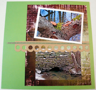
Forever Park

This scrapbook page layout has been laying on my table for about a week now. After choosing the paper for the left side, the right side paper must've switched about a hundred (at least 5) times.


I didn't feel the left side needed much added to it, since the paper (from My Mind's Eye) is so pretty, and the texture is similar to watercolor paper, so it almost looks like a watercolor painting.


The right side of the page was what really stumped me, but finally just left it simple.


I really wanted to create the look of hanging paper lanterns but couldn't let it sit on my table any longer, so just popped up some blossom punches and baker's twine and called it a day!


HOW-TO:
  • The left side paper and the Forever title is from So Sophie by My Mind's Eye and the right side is the Portrait Collection Pearls by Crate Paper
  • The bird and journal box on the left is from Flea Market by Colorbok
  • I found the border at the top right in the collection For the Record by Echo Park Paper Co. and similarly colored Bazzill cardstock paper
  • I used the Creative Memories Blossom Place 'n Punch and zotted them over baker's twine from My Mind's Eye
  • I used a Martha Stewart Punch around the page to create the delicate cream colored border
  • The little silver brads are from 7Gypsies

Happy Shower

Here is a card I made awhile back for my friend's bridal shower, but didn't want to post it till the shower was over. I just love the colors!


I had just bought some new supplies at my favorite scrapbooking store that is sadly, now closed. My friend and I went there for some last minute stocking up, and I found that beautiful background paper and immediately thought it'd be perfect for a card!


This last close-up, was taken just for fun, but also to show the fabric texture of the letters, love those!


HOW-TO:
  • Unfortunately I didn't see the name of the company that did that background paper, but once I picked that as the paper, the rest was pretty easy
  • The ribbon is American Crafts' Robin's Egg Crochet Trim which I got in Studio Calico's May kit, Lawn Party and attached with the Tim Holtz tiny attacher
  • The deep burgundy flower was from Kaiser Crafts
  • The light bluish-green tinted clear button was from My Mind's Eye, Lost & Found tied with some twine and zotted onto the flower
  • The Doll fabric chipboard letter stickers are also from American Crafts

Saturday, July 23, 2011

Tropical Conservatory

This scrapbook layout was a bit tricky because I did not have any of the photos for it printed yet and wanted to wait to print them in case I wanted to change up the sizes, so this required some extra planning, but I'm happy I waited to print them!


I decided, after feeling a bit blah about the last bike ride layout, that I wanted to make sure I incorporated more pictures this time, to keep the pages interesting and "fuller" feeling. So I used a basic sketch I saw in the e-book "Double-Page Design" by Ella Publishing Co on p. 29.

I thought this time I'd try inspiration for a double page layout instead of trying to fit 2 separate single page layout designs together, hoping to give it more continuity (I guess, the old-fashioned way of thinking of something myself didn't really appeal to me haha)


The hardest part of the left side was figuring out how to get the title and journaling in there, so finally decided to print something up on my computer (used font Segoe Script) so it would fit in the wood frame, but also still look like part of the page. I ended up using a graphic from my PrintMaster program and reducing the opacity of the image behind the text so the text would stand out, and I could just print on white cardstock instead of choosing from my limited printer paper color cardstock.


I accidentally left a small, but glaringly noticeable space in the middle of the right-side, which I didn't notice till AFTER the pictures were already very well-adhered into place. Poor husband, not knowing my dilemma, suggested I just move the middle picture down a bit to fill the space... instead I found a dragonfly rub-on from an old stash of stuff that ended up fitting perfectly, both in size and color.


HOW-TO:
  • The paper, which really made this layout come together, is Butterfly Garden by Pink Paislee
  • The handmade paper flowers are Flora Doodles by Petaloo - I used all but 1, and at $4.59 per 8, using 7 for this layout basically cost me $4 to add this embellishment! Sometimes, it's just crazy to think how much a page layout costs in time and money... but isn't it worth it!?
  • I used a Fiskars punch on Bazzill cardstock to create the strips of pictures, also having printed and cut the pictures to about 3.75"x2.8125" haha (originally was going to use 4 3x3 pictures on each side, but realized my printer didn't understand this dimension, so re-acclimated my layout idea to fit this new constraint)
  • The wood veneer frame was chalked with VersaMagic Hint of Pesto ink and is from Studio Calico

Thursday, July 21, 2011

The Other Side

Stayed up super late last night to get the other side of this page layout completed before I changed my mind for the millionth time on how to do this side of the page!


The idea was lifted from this layout called "Wing it!" by Sarah Webb. Not only did I get the layout idea from her, but the title really pushed me to just do it and get it done!


HOW-TO:
  • Using papers from the Good Day Sunshine collection by My Mind's Eye I cut one piece to 10"x4" (for the top part, even though a little less than 4" is showing) and another piece to 11"x7", plus a strip for the bottom 10"x3/4"
  • Decorated an Inkessentials Craft tag with a title from the Good Day Sunshine punch outs that also came with the collection
  • The rest of the punch-outs were from the same collection except the tree I bought separately, but it is also from My Mind's Eye so it matched pretty well
  • The dome studs are from 7gypsies and came in the July kit "Mind the Gap" by Studio Calico

Wednesday, July 20, 2011

Good Day Bike Ride

Here's a scrapbook layout from back in March, when Chris and I finally got out for our first bike ride of the season! Of course, these pics were taken right before we both got new bikes, so I guess I'll be re-doing a similar layout soon!


I lifted the page layout idea from p.32 of the July issue of Scrapbook Trends, a layout called "Ticket 2 Ride" By Jamie Harder. Hers was themed around a carousel ride, so mine is obviously themed around a bike ride. The only problem now is... what do I do for the other side of this layout!? Oh well, guess I'll figure that one out later.


HOW-TO:
  • Using paper (and bicycle embellishment) from the My Mind's Eye Good Day Sunshine collection, I cut a piece to 11x11 and mounted on Kraft cardstock, with the bottom 4.5" flipped around to show the other side of the sheet
  • The tickets are from Tim Holtz and popped up
  • I cut the letters by hand from a sheet of paper from the same collection to use for the "Ride" part of the title
  • The toothpick flags are from Pebbles and the puffy, white letter stickers are from K&Company's Animal Tales

Sunday, July 17, 2011

A Vintage Summer

This is a quick 8x8 scrapbook page layout I was asked to do for a longtime family friend's upcoming birthday, so it was a rare chance for me to do an 8x8 page!


I found this old picture from my parent's house, and with my little Canon Selphy CP800 printer, it was easy to get a copy and just print the photo... I could've edited the colors, but the look of the faded picture really made the page feel vintage and went with the theme better.

HOW-TO:
  • The paper is Vintage Whimsy by the girls' paperie and since it was 12x12, cut to 8x8
  • The Candy Store card embellishment and button are from October Afternoon's 5&dime Mischellany - that, the paper and the ribbon were in the May "Lawn Party" kit from Studio Calico
  • The cloth banners are from Maya Road
  • The chipboard letter stickers are from American Crafts

Friday, July 15, 2011

4 Wheelin'

OK, I take that back about that Jurassic Park layout being my favorite... this 4 wheelin' scrapbook layout is my newest favorite! I got the inspiration and start for my layout from this layout: A Cowtown Birthday by Emily Pitts.


After I found the inspiration, the paper and pictures sat out on my table for the past few days as I contemplated and re-contemplated how much of the layout I would lift (<-"lift" is the scrapbooker's softer way to say, "copy" hehe). Finally, tonight I just decided if I didn't just start cutting up some paper, I would NEVER get started! I guess it is scary for me to get right in there and start cutting up beautiful paper, so I just had to do it!


This left side came together fairly quickly once I got the black strips cut properly (I am left with quite a few practice strips that weren't straight enough so they now reside in the garbage).

I also lifted from my own last layout, and after I couldn't figure out how to incorporate one more picture to get that closeup one of the four wheeler, I took out my Exacto knife again, cut around it, and popped it up for another 3D picture embellishment - this might end up being a signature strategy I will employ more often...


Lastly I knew that I wanted to add those little sprockets from Tim Holtz! I've been dying to use those for awhile now, so used those with some old school punched circles... wow I've been scrapping for awhile now to be using the term "old school" for a scrapbook technique haha!


HOW-TO:
  • Pretty much everything except the sprockets and letter stickers are from the July kit, "Mind the Gap" by Studio Calico
  • The main patterned paper is "London Calling" and the brown circle pattern paper is from American Crafts with the orangish-blue border being part of the same paper, but was at the bottom that you tear off, so I used it since I cannot possibly let that go to waste!
  • The punched strip of yellowish paper was another bottom tear off strip on a piece of Sassafras paper
  • This time I remembered not to adhere all the paper before deciding if there were things I was going to want to add... so the Bazzill Kraft cardstock was distressed using Tim Holtz Vintage Photo distress ink first, which is a LOT easier than waiting till it's already adhered down!
  • I cut the black Bazzill paper using the Postage Stamp blade from Creative Memories
  • Like I said, the sprockets were from Tim Holtz and since I'm only left with one, I will need to re-stock (and also force my husband to go four wheeling again, this time in like the summer or something haha)!
  • The circles were punched with the circle and mini circle makers by Creative Memories and the letter stickers were the Swirly alphabet also from CM

Saturday, July 9, 2011

Similar but different... thank you card!

This is a great example of making use of leftover scraps to turn it into something new! This is a thank you card for my mom's friend who threw me a beautiful bridal shower recently!


I had a small square of this beautiful butterfly paper from another card, which was just enough to use to back the entire front of this card. Instead of just having one block of paper, I trimmed off a bit, then punched a border into it, and used a mini stapler to sort of decorate the edge.


Of course, halfway through stapling the border together, I ran out of staples! Luckily my husband understood the emergency and took me right away to AC Moore to get refills, and while I was there I happened to find those cute little fabric flowers! What luck! The stickpins were from the corsage that I was given to wear at my shower, so it was the perfect personal touch for this card - and of course unplanned!

HOW-TO:
  • Cut a piece of Kraft cardstock to 6x8.5" and folded in half, then cut a piece of Fly By paper from Studio Calico to 4x5.5", then a strip off that around 3/4" in
  • Punch the extra 3/4" strip with Fiskars border punch and staple using Tim Holtz Tiny Attacher
  • The fabric flowers are Prima flowers
  • The chipboard letters are by The Girls' Paperie

Friday, July 8, 2011

Welcome to Jurassic Park!

OK, this might be my best scrapbook layout I've ever done... at least in recent memory, but I can't really take credit for it, since probably 45% I can contribute to scraplifting the idea, and 45% is due to just having some great supplies delivered to my house today... therefore I will take 100% credit for 10% of this layout!


I started with the left side this time, after having stumbled across a digital scrapbook layout here called "Walking With Dinosaurs" by Jennifer Wight (here's a picture of just the page layout by itself). Since I didn't have the ability to move or crop images so perfectly the way that is done there, I had to whip out my Exacto knife and try to crop them myself!


The picture of the T-Rex on the right side was an actual picture I took while at the museum, and using said knife, cropped that myself as well! Wow, such primitive scrapbooking methods... The wood frames were part of the order I received and just matched so well, I had to use them right away!


OK, so the bamboo was an afterthought, so that took a bit longer to add, since I couldn't rip up the map to get it behind there, I had to cut again by hand. Unfortunately, a lot of times there are things I see that I would've liked to do differently or add only AFTER I've already adhered/cut everything no matter how much I try to draw out and plan a layout... oh well, I'm still very happy with this one!

HOW-TO:
  • Main patterned paper used is Run-of-the-Mill by Studio Calico (from this month's kit: Mind the Gap)
  • Cut the map from the Life's a Party Cricut Cartridge at 10.5" using Creative Memories French Vanilla paper and distressed using Tim Holtz Vintage Photo distress ink and popped it up
  • Wood frames are also from Studio Calico
  • Popped up the cut out picture of the T-Rex, and it really looks 3-D
  • Jurassic Park letters were cut at 1.8" off the Life is a Beach Cricut cartridge on Bazzill paper, but in hindsight I wish I had chosen more of dark wood-looking paper to match the overall jungle-like theme
  • Bamboo was cut from the Life is a Beach Cricut cartridge at 10.5"

Thursday, July 7, 2011

Smashbook Pages!

Recap: I'm using my Smashbook as a place for stuff and pictures that wouldn't make a full scrapbook page layout or wouldn't fit into any particular scrapbook.

For my wedding and honeymoon pictures, I've put them into an album but had some extra "stuff" that I wanted to keep, so threw them in here as well! The dried flowers in the pocket were the Dendrobium Orchids that were in my hair.


For the next page, I took the photo of me and my husband getting (re)baptized from our church's new website: Calvary Chapel Westside and kept the little announcement of the picnic and baptism from the church program one Sunday. The other side are a couple of pics I took on my iPhone from Fathers Day, walking around my in-law's neighborhood.


For this last page, I had taken just a few snapshots from a random day going to a lakeside restaurant for dinner. I printed out the restaurant menu from their website and threw it in there, which was an added touch because they recently updated the menu which forced me to try something new! My favorite picture of the group is the picture taken when I caught Chris in our kitchen later, finishing our ice cream wedding cake after we had just pigged out on a huge dinner!

Tuesday, July 5, 2011

Winter Park

Last night I got a chance to finish up one more scrapbook page layout after an awesome nighttime bike ride around the neighborhood to check out everyone's fireworks! So I had a very productive 4th of July!


I think I'm just anxious to finally get to some spring/summer photos to scrapbook because all the magazines and papers that are out right now, are for that - and who wants to reminisce about last winter when summer's just getting started! Well this was a fun day we had going to Durand Eastman park earlier this year.


I was planning to add more to this simple layout, but decided I liked the way it turned out and just plan to leave it as is. I got the basic idea for the right side of the layout from p.33 in the July issue of Scrapbook Trends, a layout called "Be Here" by Jamie Long. So this right side came together before the left side (backwards for me).


HOW-TO:
  • For the left side, and the first thing I always do is pick out the main background paper, I chose BoBunny Beautiful Life Collage paper
  • Backed the bottom photo with plain white paper cut at 6.5x4.5"
  • Used my, apparently go-to tool, the Fiskars notebook page punch punched a border onto Bazzill Kraft cardstock, then cut it at 5x4" and used for a journal block
  • The upper right I cut part of an extra strip of paper I had made for the right side of the layout, and backed with more Kraft cardstock to match
  • For the right side, I used a piece of Bazzill Bank Roll cardstock, then cut a piece of the same BoBunny paper at 11x8.5"
  • I used a scrap piece of Kraft cardstock to punch the circles with an EKSuccess border punch
  • The easiest way I've found to make a thin strip of paper interesting, is to add some personalized words, so I just run some cardstock through my printer and print sideways using Editor font at 9pt. then cut 1/4" strips - I usually cut several of these, to make up for any mistakes, or if I want to use it on the other side as well (which I did here)

Monday, July 4, 2011

A Scrapbook Layout!

Happy 4th of July, happy birthday USA!!

OK, I've had like 2 seconds in the past 5 days to throw together a scrapbook page layout before I went insane from not scrapbooking with all the time off from work! So I finally started a new album for 2011, kicking off the scrapbook with pics from our trip to Syracuse, NY to see the Orangemen play on New Years Day! We are hoping to start a tradition and go see them every New Years!


Most of this layout came together with the Primary Basketball Additions from Creative Memories, so it was quick and easy and while it's not my most labor-intensive layout, I'm happy with how it came out.


HOW-TO:
  • The main 2 pieces of paper, title sticker and basketball hoop sticker were all from the Basketball Additions from Creative Memories
  • For the left side, I tried to use the Fiskars notebook punch to create a notebook looking page and border
  • The stars were made using the Creative Memories Embossed Star punch
  • For right side, I used Inkessentials Craft Tags to create ticket-like tags
  • The basketball dude was cut at 5" using the Sports Mania Cricut cartridge


I didn't leave much room for journaling, so a couple things I will just add here:
* I love foam fingers and food, so I got one and a ton, respectively
* My husband Chris, will probably want to kill me for showing that close-up pic of his face, but I love it
* Along with seeing familiar players from last season up close (Scoop Jardine, Kris Joseph, Rick Jackson...), it was really cool to see Jim Boeheim!