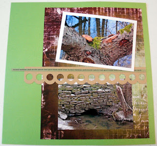
I think I'm just anxious to finally get to some spring/summer photos to scrapbook because all the magazines and papers that are out right now, are for that - and who wants to reminisce about last winter when summer's just getting started! Well this was a fun day we had going to Durand Eastman park earlier this year.
I was planning to add more to this simple layout, but decided I liked the way it turned out and just plan to leave it as is. I got the basic idea for the right side of the layout from p.33 in the July issue of Scrapbook Trends, a layout called "Be Here" by Jamie Long. So this right side came together before the left side (backwards for me).
HOW-TO:
- For the left side, and the first thing I always do is pick out the main background paper, I chose BoBunny Beautiful Life Collage paper
- Backed the bottom photo with plain white paper cut at 6.5x4.5"
- Used my, apparently go-to tool, the Fiskars notebook page punch punched a border onto Bazzill Kraft cardstock, then cut it at 5x4" and used for a journal block
- The upper right I cut part of an extra strip of paper I had made for the right side of the layout, and backed with more Kraft cardstock to match
- For the right side, I used a piece of Bazzill Bank Roll cardstock, then cut a piece of the same BoBunny paper at 11x8.5"
- I used a scrap piece of Kraft cardstock to punch the circles with an EKSuccess border punch
- The easiest way I've found to make a thin strip of paper interesting, is to add some personalized words, so I just run some cardstock through my printer and print sideways using Editor font at 9pt. then cut 1/4" strips - I usually cut several of these, to make up for any mistakes, or if I want to use it on the other side as well (which I did here)


I love your color palette, and how it draws from your photo. Thanks so much for the shout out and I am honored you liked my page.
ReplyDeleteThanks for your nice comment Jamie! People always think that I am so creative, but if it weren't for people like you, I wouldn't have ideas to pull from! I loved how that original page you made started as an 8.5x11 page and turned into a 12x12... it worked so great for me here, I will probably use that technique more in the future :)
ReplyDelete