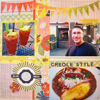
Chris just loves Creole style food and enjoyed his gumbo, which he said was actually "étouffée" (OK, now that I wrote that for this blog entry, I just had to look up what the heck that is and found a description explaining the differences of gumbo, jambalaya, and étouffée here)!
Anyway! The idea for the layout came from Kelly Purkey's Sketchpad class pdf! My favorite part of the layout was the mistable banner - I was able to mist it to match the colors from the layout! The rest of the page, minus the banner, letter stickers, and washi tape came together using the PB&J line by BasicGrey. I loved the colors of the line and they went perfectly with these pictures!
HOW-TO:
- The papers, "Major Award" embellishment and metal flower were from the PB&J collection by BasicGrey
- The banner is the Heidi Swapp Color Magic Banner Delicate by Pink Paislee - it was my first use of anything "mistable" and I misted using Mister Huey's mists by Studio Calico in Schoolhouse, Lemonade, and Applejack
- For the misting, Chris even helped a little (at first I needed help getting the Schoolhouse color going and then he wanted to do some misting too)! He thought it was so cool when I started wiping away the mist and revealing the pattern underneath... but then quickly went back to the garage, probably to clean something!
- The letter stickers are Newberg Navy Alpha from Jillibean Soup
- The banners and letter stickers both came in the Lomography add-on kit from this month's kit "35mm" by Studio Calico
- Lastly, I filled the tiny space above the top right photo with a couple pieces of washi tape!


No comments:
Post a Comment